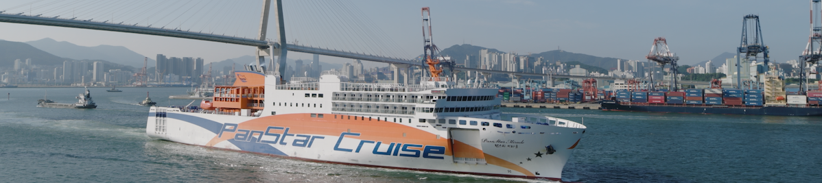
PanStar, a company opening a new horizon in Korea’s logistics industry, has grown into a comprehensive shipping group by introducing a series of vessels starting with the large car ferry PanStar Dream in 2002, followed by PanStar Sunny, PanStar Honey, SanStar Dream, Starlink One, Starlink Hope, PanStar Genie 1, and PanStar Genie 2. Through these vessels, PanStar has offered high-speed cargo ferry services that rival air transport and distinctive cruise passenger services, establishing itself as a leader in integrated maritime logistics. In April 2025, the launch of PanStar Miracle brought a new wave to Korea’s cruise industry. The PanStar symbol, inspired by a ship’s funnel, represents the company’s commitment to innovation in logistics networks centered around maritime transport.
Symbol Mark
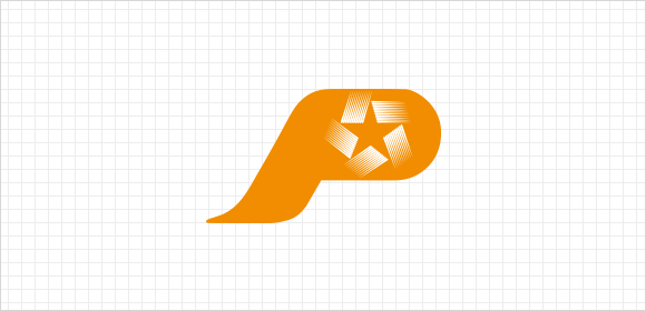
The symbol mark that embodied the shape of the funnel in the ship represents the image of PanStar. It is the core element of the CI system, and the shape or colors should not be changed.
Signature
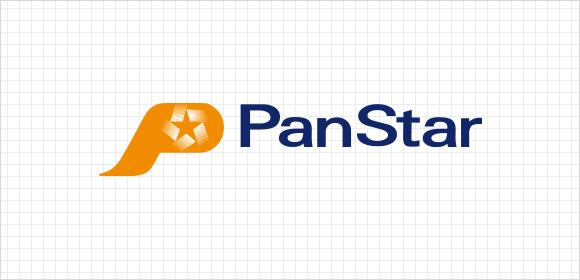
The regulations and principles for applying the symbol mark must be followed to prevent the damages of the image caused by the distortion, modification, and abuse of the identity.